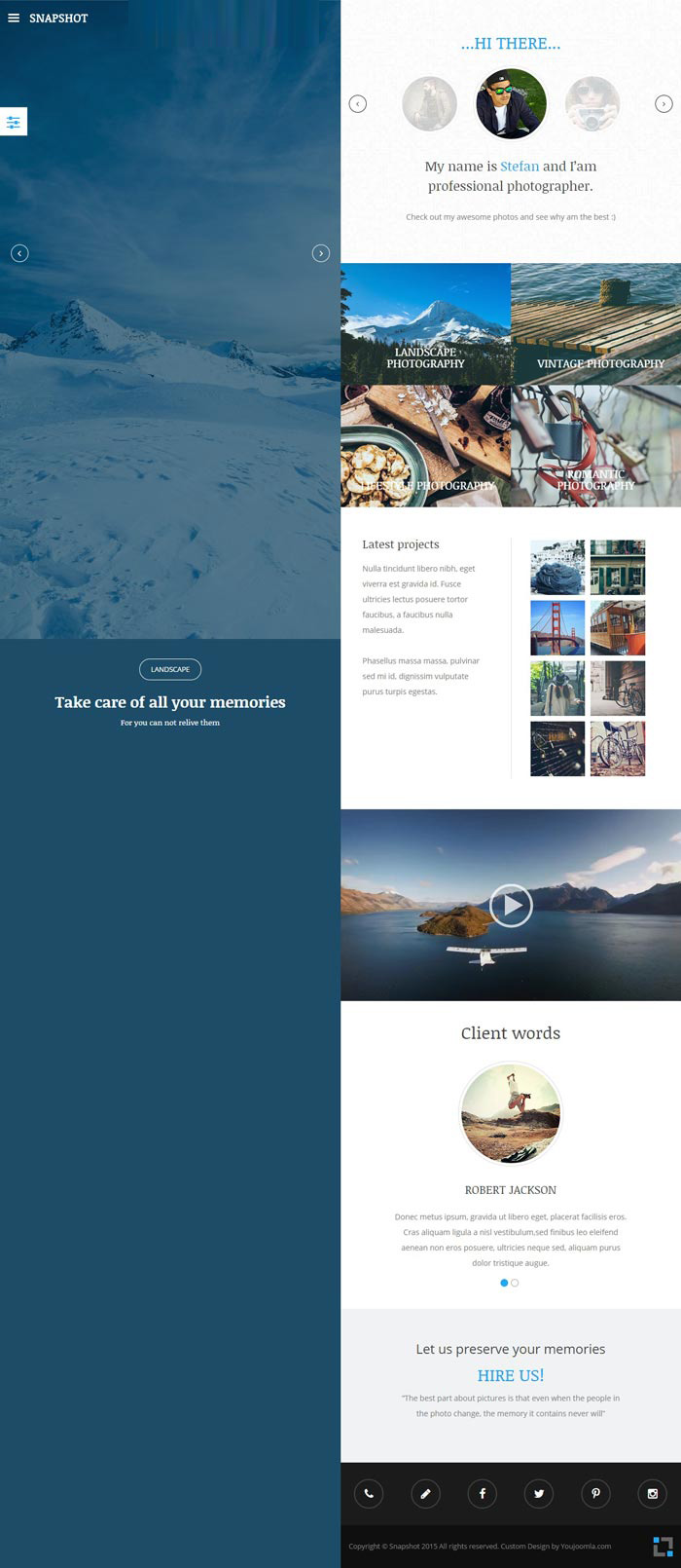
The YJ Snapshot template features a fully responsive layout that adjusts to fit any screen size or device, ensuring that your website looks great on desktops, laptops, tablets, and smartphones. The template also includes a number of customization options, allowing you to tailor the design to your specific needs.
Some of the key features of the YJ Snapshot template include a customizable slideshow module that lets you display images or other content in a dynamic and engaging way, a built-in menu system that makes it easy to navigate your website, and a selection of pre-designed page layouts that you can use as a starting point for your own designs.
In addition, the YJ Snapshot template is built on a powerful framework that provides a solid foundation for your website, with clean, well-organized code that ensures fast load times and reliable performance. Whether you're building a portfolio site, a photography blog, or any other type of visual-focused website, YJ Snapshot is a great choice that can help you showcase your content in the best possible light.


 Sign in with Google
 Login with Facebook